I Tested 8 AI Design Tools to Redesign My Portfolio - Here's What Worked

I’m not a designer, there’s not a creative bone in my body unfortunately. Luckily I’ve always worked with great designers who work wonders in Figma. When it comes to personal projects, however, I’ve always just got whatever I need to do functional and sprinkled on enough CSS to make it bearable.
With AI design tools improving rapidly, I figured there had to be something that could generate a portfolio mockup better than I ever could. I’d used V0 at work and heard about Magic Patterns, but knew there were more options out there. After some searching through Google and Reddit, I landed on eight tools to test:
- Claude - AI assistant with artifact creation
- Magic Patterns - Design generation from prompts
- Reforge - AI powered design tool
- V0 - Vercel’s AI design-to-code platform
- Lovable - AI app builder
- Base44 - Context aware design generator
- Replit - AI powered development environment
- Figma Make - AI-to-Figma design tool
All offer free tiers that actually let you generate designs, not just teaser features. For a straightforward redesign like mine, each could handle creating original designs from the context I provided.
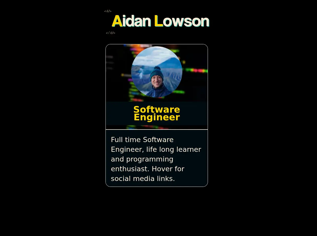
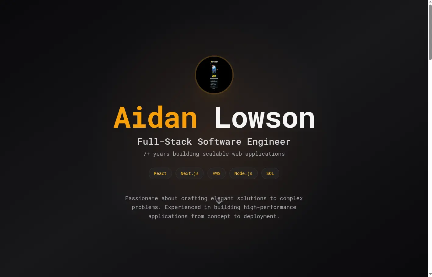
The Test I gave each tool the same challenge: redesign my developer portfolio site at aidanlowson.com. Every tool received an identical prompt along with a screenshot of my current site:
I’m a full stack developer, working in the industry since 2018 (so 7+ years experience) looking to re-design my developer portfolio site. aidanlowson.com
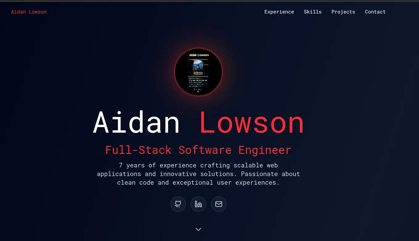
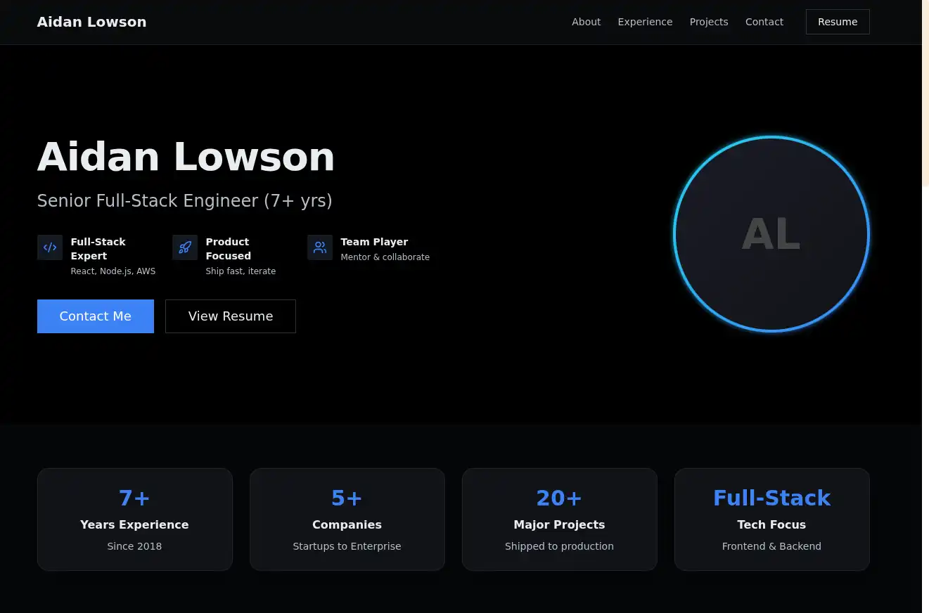
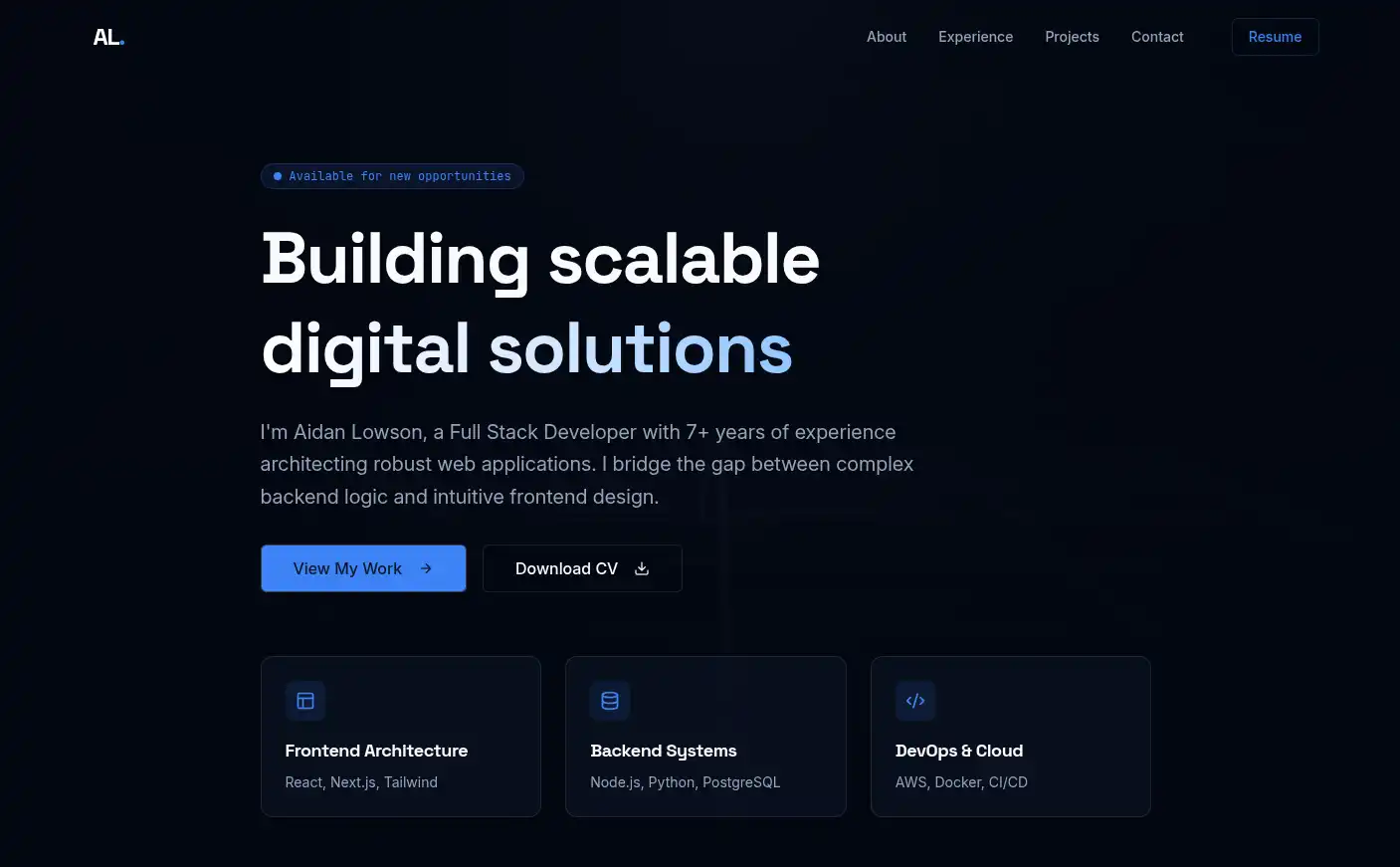
The Winner
Figma Make delivered the best overall design. What set it apart was the combination of quality output and iteration speed, when I asked it to change the secondary color, it updated the entire design in about a second. No other tool came close to that responsiveness.
The design itself was clean and well-structured: a minimal layout that highlighted the essentials (work experience, skills, projects, and contact form) without feeling cluttered. The color palette was consistent throughout, and the dark gradient background with subtle glow effects gave it a modern, polished look that felt professional without being generic.Beyond the design quality, Figma Make’s pricing made it an easy choice. They offer 3 free designs, and paid plans start at just £3/month (billed annually) for unlimited designs, significantly cheaper than most alternatives.
The rest of the pack
While Figma Make took the top spot, the other tools produced varying results. Here’s how each one performed:
Claude
Clean gradient background and title colors with strong CTAs. However, the layout wasn’t quite what I was after I preferred the more centered, focused designs from other tools rather than this spread-out approach.
Magic Patterns
Strong contender. It picked up my original portfolio’s secondary colors and added a nice yellowish blur effect behind the profile picture. The technology tags under the heading were a good touch for quickly showing my stack. One quirk: it used my screenshot as the profile picture, which was unexpected but easy enough to swap out.
Reforge
Solid color choices and strong CTAs (Contact Me, View Resume). Like Claude’s design, the spread-out layout wasn’t my preference, I gravitated toward the more compact, central compositions from Magic Patterns, Lovable, Base44, and Figma Make.
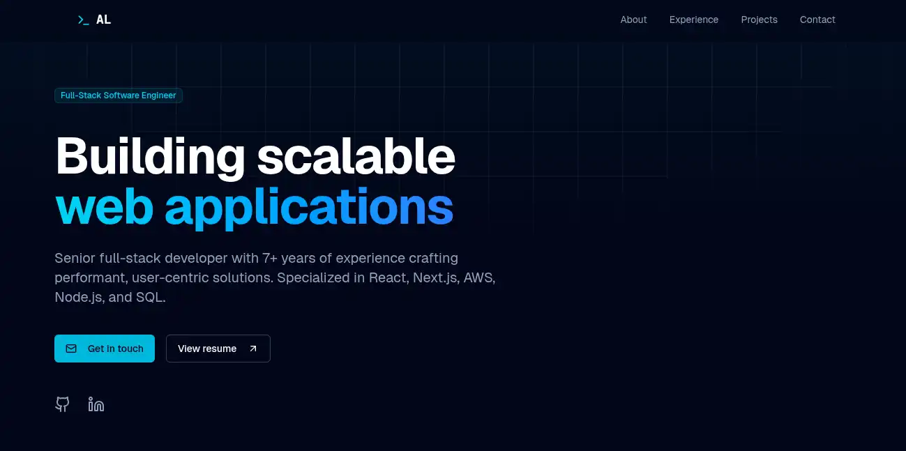
V0
Weakest of the bunch for pure design work, though that’s understandable since V0 is built more for design-to-code generation. The gradient title looked nice, but it wasn’t immediately clear whose portfolio this was. The CTA buttons were well done, at least.
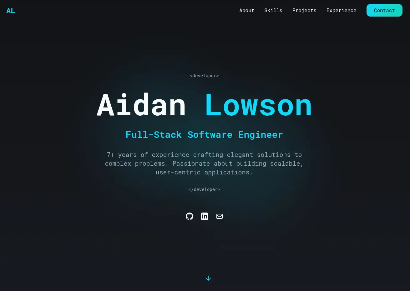
Lovable
Beautiful, modern design with a clean background. The subtle <developer></developer> tags around the intro were a nice developer-focused detail. My only critique: no profile picture area, which would’ve made it feel more personal.
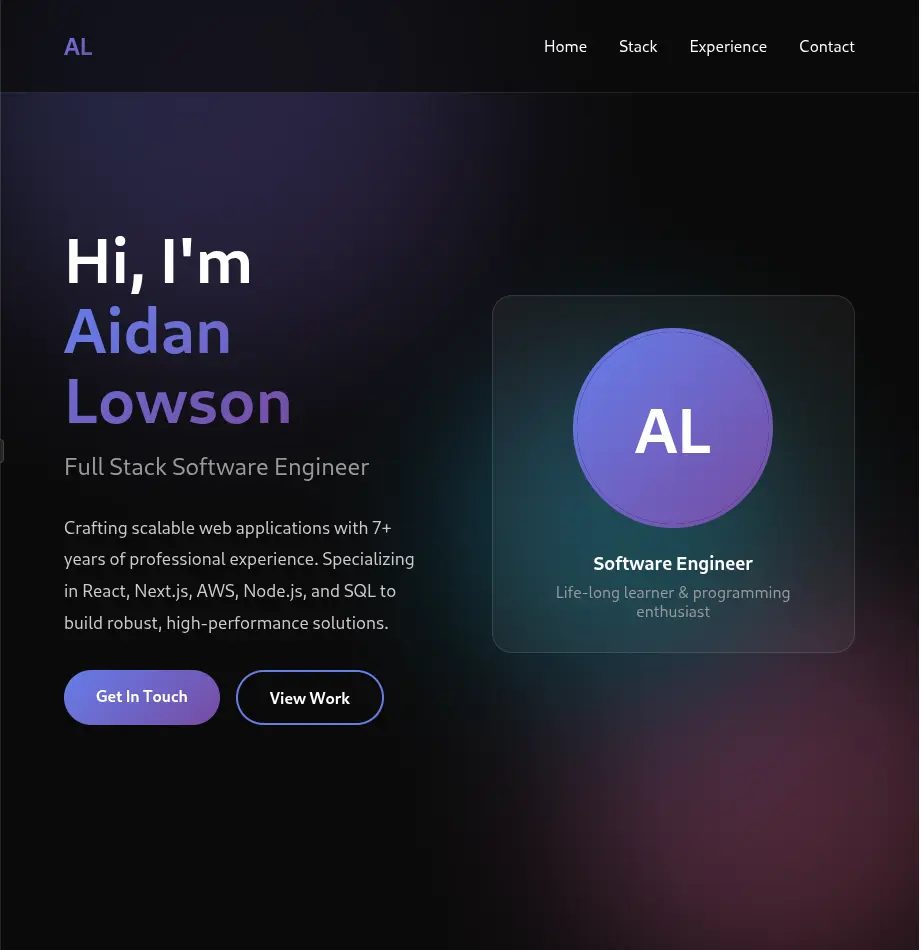
Base44
Best at context extraction, it actually pulled specific projects from my existing site and incorporated them into the redesign. The bold title with the centered profile picture created strong visual hierarchy, and the colored border around the photo was an interesting design choice that made it pop.

Replit
Attractive design overall, but like V0, it failed the “immediate clarity” test, visitors wouldn’t instantly know whose portfolio they were looking at. For a personal site, that’s a critical miss. I want people to land on the page and immediately understand who I am and what I do.
The Verdict
Figma Make is my clear choice going forward. With 3 free designs to start and paid plans at just £3/month (billed annually) for unlimited designs, it offers the best combination of quality and value. If you need to stay in the free tier beyond 3 designs, Magic Patterns is your best bet with their generous base offering.
A quick Reality Check
This space evolves incredibly fast. The information here is accurate as of November 24, 2025, but new tools launch constantly and existing ones improve rapidly. What’s true today might be outdated in a few months, so always check current pricing and features before committing.
What’s Next
The fact that we can generate professional-quality designs in seconds still amazes me. These tools have genuinely lowered the barrier for developers like me who need decent design but lack formal training. My next step: implementing the Figma Make design to give my portfolio its first proper refresh since 2018. I’ll update this post with before/after shots once it’s live.